Brand identity continues inside the garment


The hangtag is often the last thing that completes a garment and the first thing we remove and throw away. I’ve decided to devote a whole article to it because, in the short time it spends in our hands, it has a specific job: to introduce the product, identify the brand it belongs to and help us understand what we’re choosing.
We ask quite a lot of something that will end up in the bin so soon.
Before removing it, though, we’ve looked at it, touched it and turned it over to find a size, a price or a piece of information. Its format, graphics and fastening have all contributed to the garment’s presentation. Even when we haven’t noticed.
For those designing it, that detail calls for precise decisions. How much space should the name take up? Which information needs to be found straight away? Does a particular technique need explaining? And how do we attach it without pulling on a lightweight knit or risking damage to the fabric?
I’m interested in this relationship between visual identity and the physical object. We may have carefully defined a sleeve’s proportions and the shade of a print; by the time we reach the hangtag, the work still isn’t finished. The customer picks up the whole thing. They don’t separate the fashion designer’s contribution from the graphic designer’s, or from that of whoever chose the cord.
I’ve chosen hangtags from Maison Margiela, Loewe and Jacquemus because they approach this task in different visual languages. These aren’t my projects: I’m looking at their graphics and some of their relationships of proportion.
Margiela: the numbers have a job to do
The Maison Margiela hangtag features a black numerical sequence on a light background, followed by the house name and the word Paris. A light-coloured cord passes through the hole; other layers are visible along the edges.

There’s something administrative about the sequence. It seems to belong to a classification system rather than an object intended to entice. It’s the choice I find most intelligent: the graphics gain character without trying to look precious.
The numbers also convey information. As the house explains on its page about numeric coding, the system was introduced in 1997 to identify its product lines; the circled number indicates the line to which the garment or object belongs. I can’t clearly make out a selected number in the photograph, so I’m not assigning the tag to a specific line.
Those familiar with the code can interpret it. Everyone else still encounters a recognisable graphic arrangement that invites a closer look.
Copying its appearance wouldn’t produce the same result. Without a real classification behind it, a row of numbers would just be a row of numbers. Nicely laid out, perhaps.
Loewe: the symbol takes up space
In the Loewe photograph, the light-coloured hangtag rests diagonally on a white garment, close to the ribbed neckline. The name, set in serif letters, sits above the black Anagram, which occupies much of the front. The tag has rounded corners; a black cord passes through the hole beside a small silver-toned metal component, on which the brand’s symbol can be glimpsed.
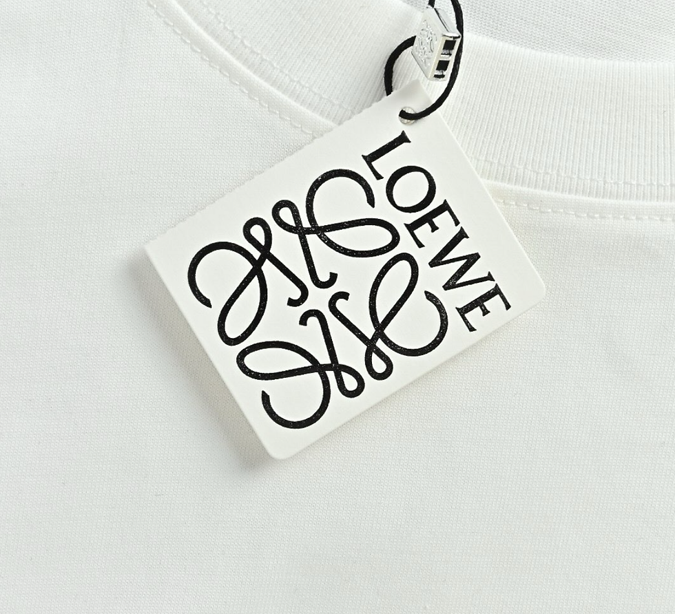
I consider it the most elegant of the three. Its balance comes from the relationship between name and symbol, both strongly present without competing to be read. The front needs little else.
The pairing with the garment matters too. The tag’s light surface stands out against the white fabric through its edge and shadow, while the black draws attention to the graphics. The Anagram’s curves contrast with the regular lines of the ribbed neckline. The cord echoes the black print; the small metal component adds a detail to examine up close without competing with the front.
The Anagram is formed from four intertwined Ls. It was designed by Vicente Vela in 1970, taking inspiration from the irons used to brand leather, as documented in Loewe’s official history. It therefore brings a reference to the brand’s material culture onto the tag, even when the product is clothing.
This continuity interests me more than a declaration about luxury. The symbol already has something to say. The garment’s quality, of course, still needs to be assessed on the garment itself.
Jacquemus: leaving the name on its own
The Jacquemus hangtag leaves a large area clear above the name, printed in black towards the bottom. The lettering is compact, the cord dark and the grain of the surface visible.

It’s the one I find most immediate: the name holds our attention without sharing the space with another mark. The empty area gives it prominence and allows the surface itself to become part of the composition.
We can observe that texture in the photograph, but we can’t establish the material’s weight, composition or environmental credentials. A natural appearance isn’t a certification.
The garment is also missing here. The tag works as an object on its own; to assess its proportions against the product, I’d want to see them together. A format that looks convincing beside a coat might feel cumbersome on a lightweight knit.
Then the hangtag has to be attached
In the artwork file, everything stays still. The name remains where we’ve put it, the front faces us and the background doesn’t interfere.
On the garment, the conditions change. The tag tilts, turns over, overlaps a pocket or covers a detail. Someone looking at it should be able to pick it up and read it without having to handle the product with excessive care.
Consider an illustrative situation: a lightweight knit accompanied by a large, rigid hangtag. Before approving it, I’d want to check the attachment point, the weight and what happens when the garment is lifted off its hanger. Does the fastening pull on the knit? Could it snag? Is the information we need still accessible?
A different cord might be enough. Or the format might need reducing, or the attachment point moving. These decisions call for the complete sample.
Art direction includes these adjustments too. It means preserving the character of the proposal while resolving a practical problem, working with the supplier making the tag and the team developing the garment. The graphics may be approved; the object isn’t, yet.
The sewn-in label stays
After the purchase, the hangtag has almost finished its job. The internal label, meanwhile, begins a much longer relationship with the person wearing the garment.
Its position, edges and stiffness become critical. A label can look perfect in a photograph and irritate the neck. At that point, scissors tend to settle the matter fairly quickly.
On knitwear, the stitching also needs to be considered in relation to stretch and stitch structure: an attachment can restrict an area that should move. Small dimensions alone don’t guarantee comfort.
Margiela offers an interesting example of the relationship between inside and outside. The house describes its four stitches as an identifying feature that holds the internal label in place and remains visible on the product’s exterior. The fastening’s function thus becomes part of the garment’s visual language.
It’s a different object from the hangtag in the photograph, but it makes clear how even a construction detail can contribute to identity.
Every piece of information needs a place
The fronts of all three hangtags carry limited text. But the photographs don’t show all the backs and accompanying elements: we can’t conclude that the brands have chosen not to tell us about the product.
The design decision also concerns how content is distributed. A text can explain a technique, help identify a variant or clarify how a detail is used. Before adding it, I’d want to know which question it answers.
“Premium” takes up little space. It explains just as little.
Brand storytelling and product information need a clear hierarchy. If every piece of content demands the same attention, customers have to search for what they need themselves. Any labelling requirements must then be checked for the product and its destination market, separately from editorial choices.
The same applies to packaging. It needs to protect the garment, hold it without distorting its shape and open in a way that makes sense. Graphics and materials can carry the brand’s tone through, but they need to be assessed within these practical conditions. A beautiful box that forces us to squash the product still needs work.
What remains when we take it off?
To assess the tags and labels, I’d suggest looking at the sample at three stages: complete with its hangtag, after removing it and finally when worn. This is a check proposed for this comparison, not a procedure I’m attributing to the three brands.
It helps us understand which elements support the presentation and which continue to work during use. It also raises a question: how much of the first impression have we entrusted to something that will be removed?
With November’s promotions approaching, a hangtag can help make visible characteristics that a discount percentage doesn’t explain. Without data, though, I wouldn’t claim it can justify a price or increase sales.
I return to the Loewe hangtag resting on the white garment. In the photograph, the relationship between graphics and fabric convinces me. Before approving it, I’d still want to pick it up, turn it over and check the fastening.
Then I’d take it off. I’d want the garment to keep deserving the same attention.
Romina Tosi
Disclaimer
The views expressed in this article reflect my personal analysis of the information available at the time of publication. The sources consulted are publicly available and may include official documents, trade union communications, press reports and other materials accessible to the public. Artificial intelligence tools were used to support the identification, consultation and preliminary verification of sources, as well as to locate and check the links included in the article. Before publication, I reviewed the relevant sources and verified that the links corresponded to the materials cited. AI assistance does not replace my editorial judgment or my responsibility for the final text. Links were checked at the time of publication and may subsequently be changed, moved or removed by their respective publishers. I do not disclose confidential information or information obtained through privileged professional access. Facts, statements, allegations and opinions are presented according to their nature. References to individuals, companies or specific cases are included to examine matters of broader relevance to the industry. They are not intended to attribute unlawful conduct beyond what is expressly documented in the cited sources. Assessments concerning industrial strategies, financial decisions and production models represent personal opinions, not findings of fact or definitive judgments.
If you identify an error or inaccuracy, please let me know. I will verify the information and correct it where necessary.
The purpose of this article is to contribute to informed discussion, not to harm any individual, company or organisation.


Comments